Switchtec
Jan de Beer started Switchtec in 2014 offering small mechanical work, 3D printing and the development of electronic controls. From advice and development to the implementation of your ideas, concepts or designs.
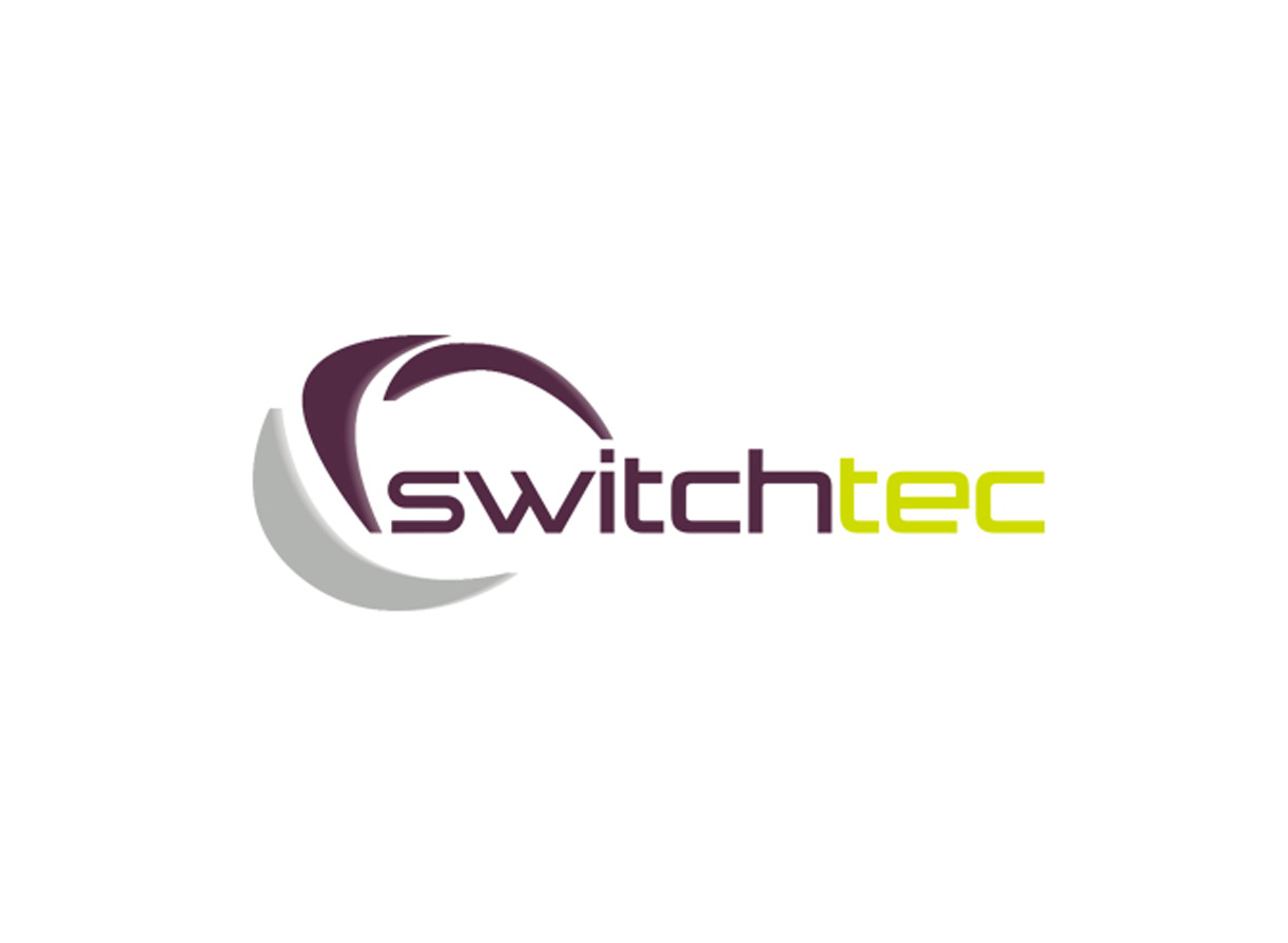
The company name was there, but a company identity was missing. The whirl in the logo is a symbol of the technical “switch” that Jan is doing every day. Gray stands for technique and the purple and lime green give freshness and a contemporary character to Switchtec.
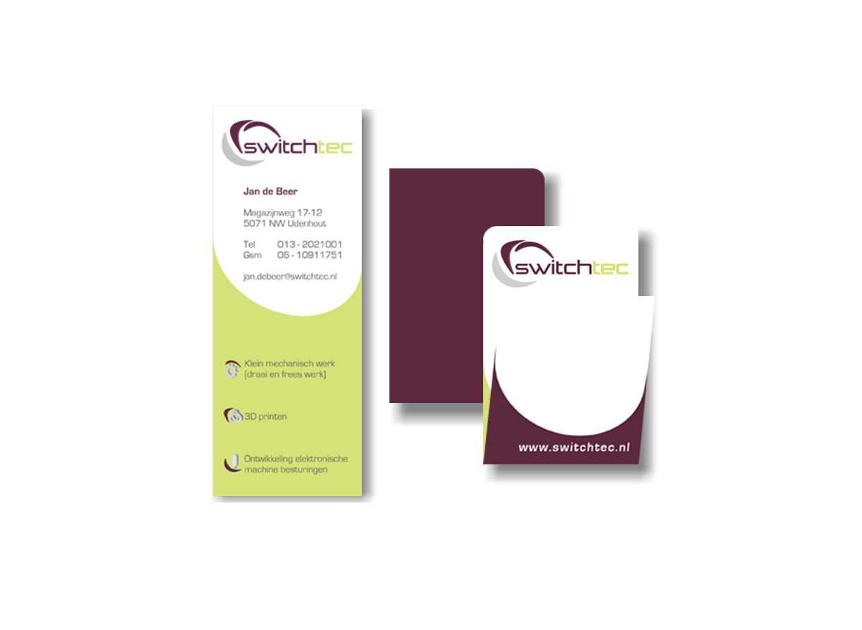
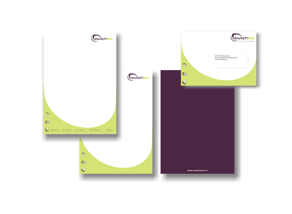
The logo is the starting point for the rest of the corporate style enabling Switchtec to present itself in a powerful way.
April 2014


